

Six blue and green combinations with a reason behind each one
Pair a navy sofa with sage chairs and walnut
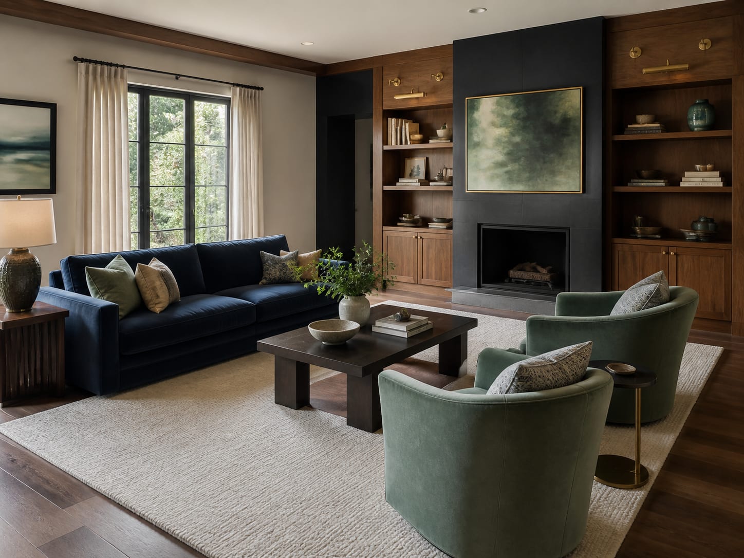
The sofa carries the deepest colour, so the lighter sage chairs can read as a pair without making the seating area heavy. Walnut behind the television connects the cool upholstery to the warm floor, while cream walls preserve daylight. This works particularly well when an existing navy sofa feels too formal: sage has enough grey in it to soften the blue without turning pastel. Keep the rug quiet and repeat navy only once in a small object or pattern. The room already has a strong anchor; it does not need blue accessories on every shelf.
Let teal upholstery meet olive built ins
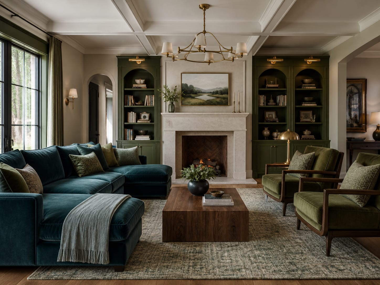
Teal and olive both contain warm undertones, which is why this stronger combination feels grounded instead of jewel-box bright. The pale limestone fireplace interrupts the two colours and gives the centre of the room breathing space. If painting existing cabinetry, sample olive on every wall of the unit because shelves create shadows that make paint appear darker. Keep books and objects restrained so the green framework remains visible. A teal sectional has plenty of presence; cushions can stay oatmeal, flax and one muted botanical pattern.
Put powder blue against one forest green wall
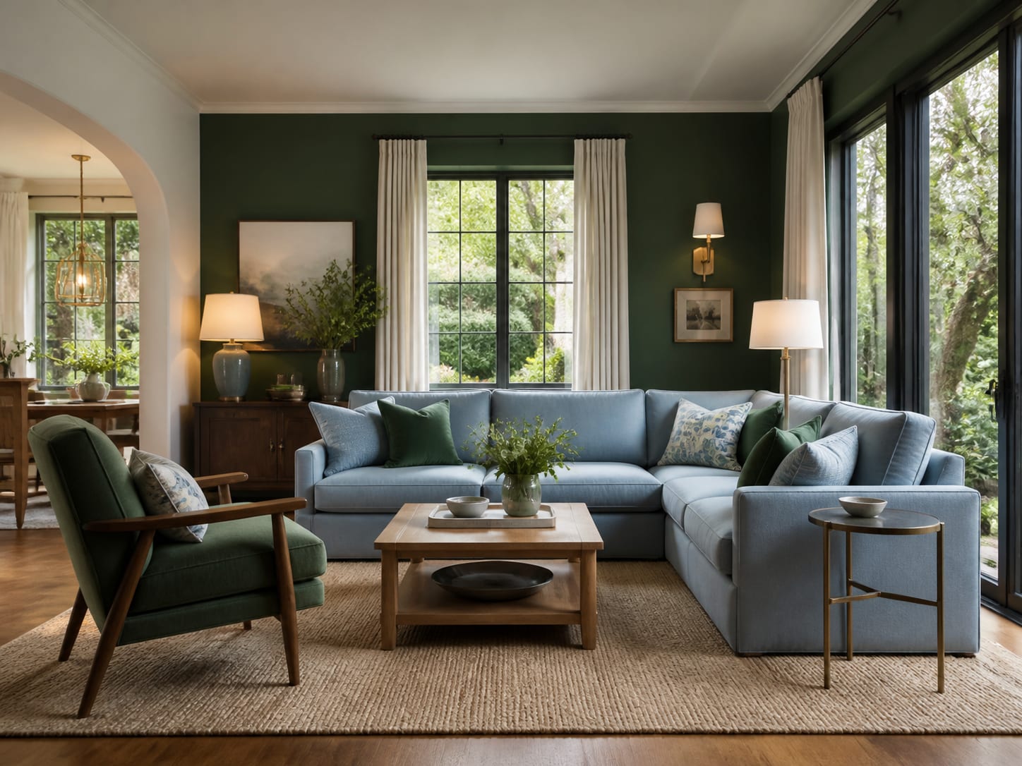
A pale blue sectional brings enough colour to be intentional while reflecting far more light than navy. The forest wall gives it definition and helps the television or artwork recede. Restrict the dark paint to the wall with the clearest outline rather than carrying it around every corner. One green chair repeats the wall at floor level, while light oak and off-white curtains prevent the contrast from feeling graphic. This is a useful scheme for a family room because neither colour shows every mark, yet the overall effect remains bright.
Combine navy panelling with an emerald curved sofa
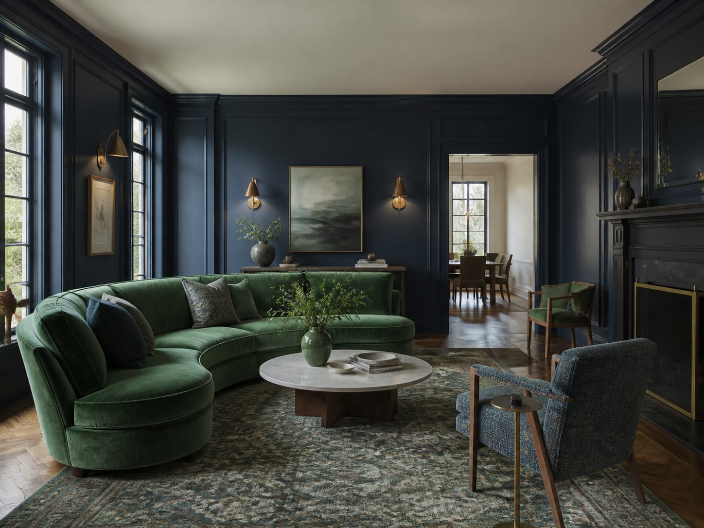
This is the most dramatic palette, but its shapes keep it from feeling severe. The curved emerald sofa breaks the rigid rhythm of the navy panelling, and the blue chair pulls wall colour into the seating group. Use this approach in a room with generous daylight or several well-placed lamps. A softly patterned blue rug can connect the pieces, but its contrast should remain low. Brass needs restraint here: one floor lamp or a pair of sconces is enough. Too many gold accents would push a composed room towards a themed look.
Warm a blue sofa with olive chairs and plaster
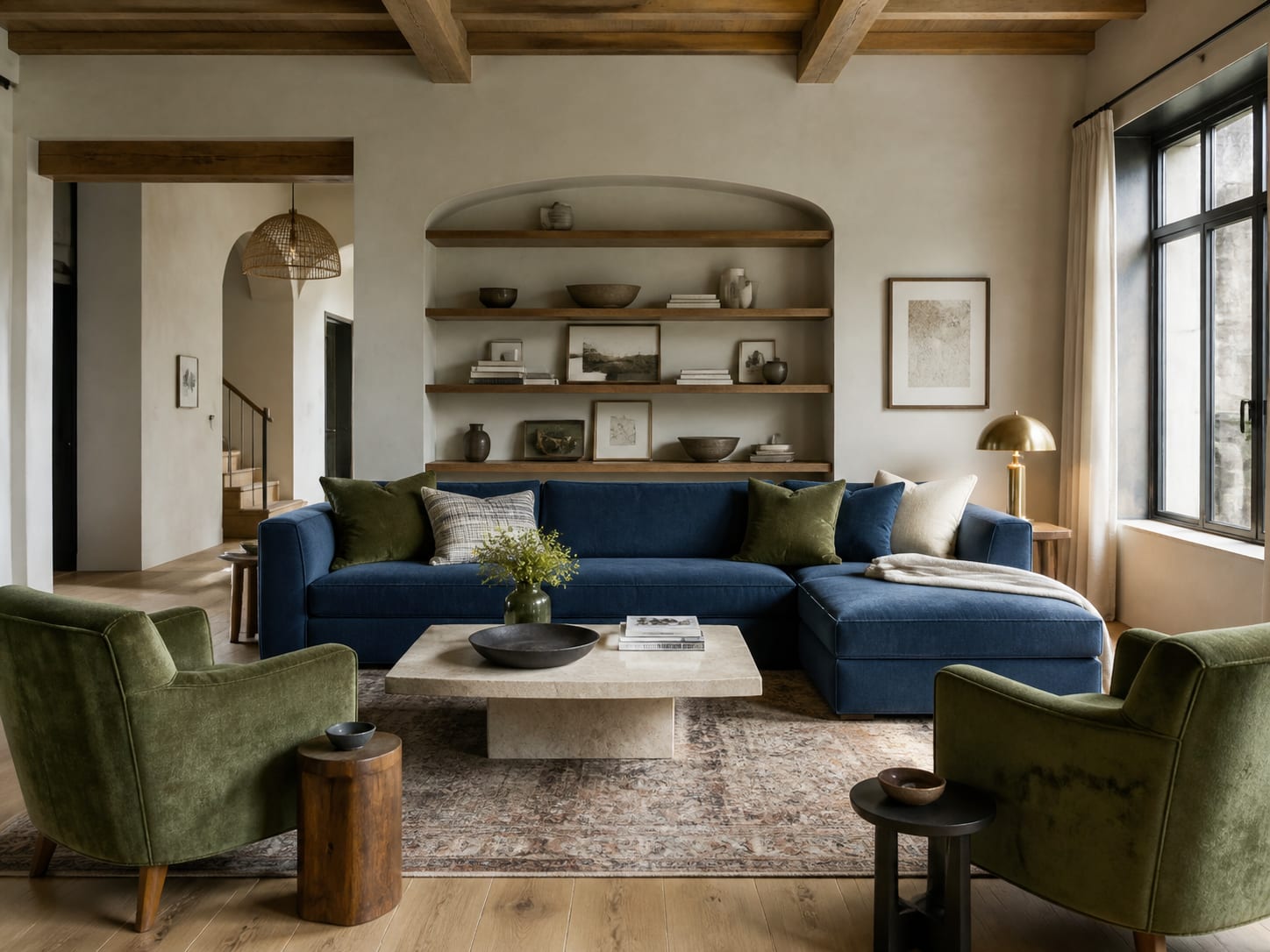
Blue and olive can look flat beside a cool grey wall; warm plaster changes the relationship. Its sandy undertone makes olive feel natural and navy less corporate. Keep the oak matte and mid-toned rather than orange, then add tactile cream through wool, bouclé or linen. This palette suits homes where the adjoining kitchen or hallway already contains warm timber because the background ties the spaces together while the upholstery adds clear colour.
Carry sage into curtains for a softer envelope
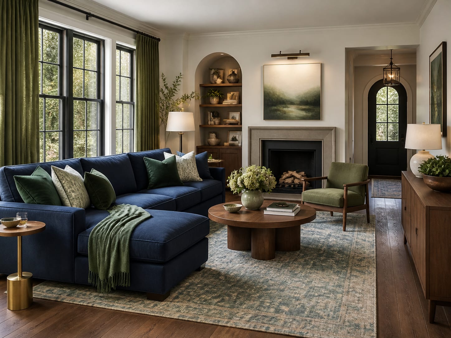
Curtains cover a large area, but sage behaves almost like a softened neutral when the fabric has a natural weave. Here they wrap the navy sectional in gentle colour and make the window feel part of the palette. The olive chair deepens the green close to the floor, while walnut keeps both colours warm. Hang the curtains high and wide, choose a lining that protects their colour and check the fabric against the sofa in daylight. A tiny swatch is not enough to judge a full wall of green textile.
Choose the pairing by the light in your room
North-facing light can cool greyed blues and make some sages look dull, so test warmer teal, olive and cream before buying. Bright south-facing rooms can carry clearer navy, emerald and forest green without losing their depth. Artificial light matters too: warm 2700K to 3000K lamps flatter timber and olive, while very cool bulbs can make a carefully layered room feel clinical. Paint a large movable sample board and place it beside the sofa, behind the television and near the curtains over several days.
A practical way to build the room without overbuying
- Photograph the flooring and fixed timber in daylight; these existing undertones decide which blues and greens will sit comfortably.
- Choose the dominant colour for the largest upholstered piece or wall, then select the supporting colour from a real fabric or paint sample.
- Add one warm bridge material such as walnut, oak, aged brass, limestone or oatmeal wool.
- Repeat the supporting colour in one medium-sized element rather than many small accessories.
- Leave at least one broad pale surface and keep the ceiling lighter unless the room has abundant daylight.
- View every sample in morning, afternoon and lamplight before ordering full quantities.
The combination should still look like your room
The strongest schemes do not depend on buying a matching furniture set. They establish a clear relationship between two colours, then make room for the objects already used every day. Start with one decisive change: paint the media joinery olive, add sage curtains around a navy sofa or introduce a powder blue sectional against a forest wall. Once that relationship works, the rest of the room can remain simple. Blue and green are convincing together precisely because they do not need constant explanation through accessories.
Join the conversation
Share your thoughts on this room