

Let the sofa establish the scale
Measure the sofa itself rather than the full wall. A gallery that extends far beyond both arms can make the seating look undersized, while a tiny cluster leaves the art floating. Mark the centre of the sofa, the top of its back and any lamp or tall plant that enters the wall visually. Then decide whether you want calm symmetry or a looser composition. Keep the lowest edge connected to the furniture, but allow for people leaning back and for frames that project from the wall.
Use an equal-frame grid for a calm, architectural backdrop
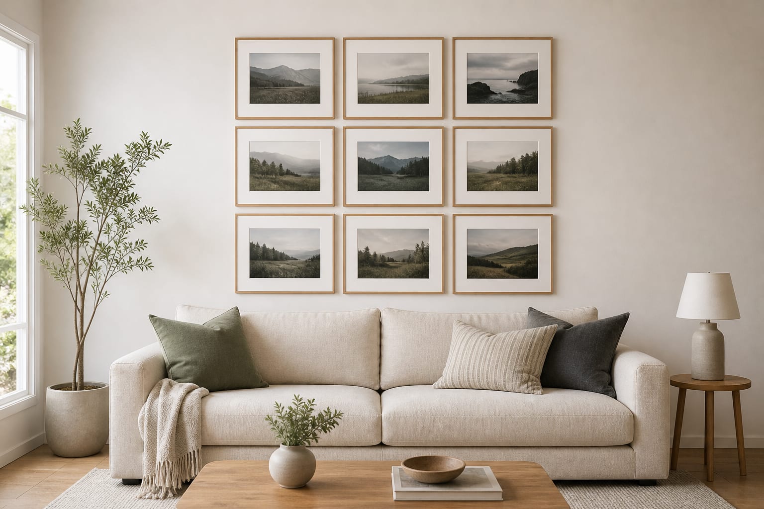
A grid is unforgiving but restful. Equal frames, mats and gaps turn nine different landscapes into one large visual unit. The arrangement is narrower than the sofa and centred on it, while the tree and lamp remain outside the composition. Measure the frames you can actually buy before calculating the grid; small differences in moulding width become obvious across three rows. A paper template or laser level is worth the extra setup because the appeal depends on alignment.
Make mixed frames cohesive through repeated mats and colour
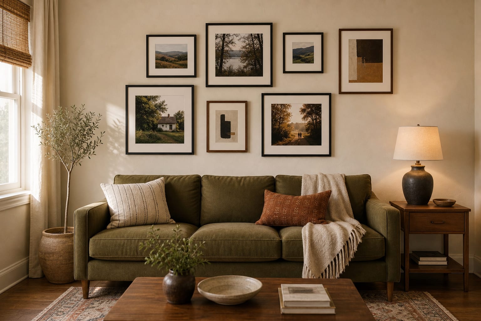
This arrangement feels gathered over time, but it is not random. Two larger photographs establish the centre, then smaller pieces fill the corners without creating a hard rectangle. Black and walnut frames each appear several times, and cream mats keep different artwork formats related. The warm rust cushion picks up the deepest tones in the art. Before hanging a mixed group, photograph the frames on the floor and reduce the image to grayscale; the darkest pieces should not all sit on one side.
Choose picture ledges for an art collection that changes
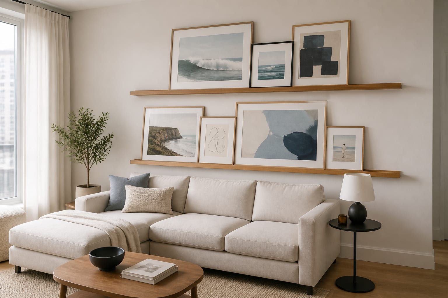
Two long ledges create a strong horizontal link with the sectional. Larger frames sit behind smaller works, but the overlaps are controlled so every piece still contributes. This format suits someone who rotates prints, although the casual appearance still needs editing. Keep the lower ledge safely clear of seated heads and use the wall fixing specified for the combined weight. Avoid filling every centimetre; one open gap gives the eye somewhere to rest and makes future changes easier.
Anchor the room with one oversized artwork and four supports
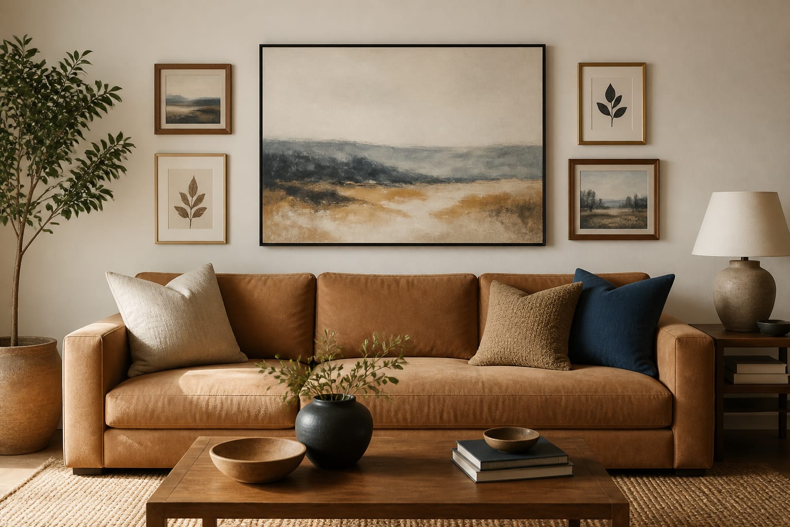
This hybrid is useful when a full salon wall feels too busy. The large landscape carries most of the visual weight, while two smaller frames on each side widen the composition to suit the sofa. The supporting pieces borrow its blue, ochre and charcoal tones without matching exactly. Leave more space around the anchor than between the small frames so its role remains clear. This is also an easy layout to expand later, provided new pieces stay subordinate.
Five details that prevent visual clutter
- Repeat a colour, subject or mat treatment instead of asking every frame to match.
- Give one piece or one row a clear visual priority.
- Keep lamps and tall plants outside the main gallery outline unless they are part of the plan.
- Use fewer frame sizes in a small room and more sizes only when the wall can carry the movement.
- Stop adding pieces when the sofa and artwork read as one balanced zone from the doorway.
Join the conversation
Share your thoughts on this room