

Use the corridor perspective instead of fighting it
Stand at the entrance and look toward the far door. Decide whether the art should reinforce that long view or create one contained moment near a bench. A continuous row benefits from aligned centres, while a compact group needs a clear furniture anchor. Mark door swings, switches and the narrowest walking point on a sketch. Then tape the outer limits of the gallery to the wall and walk past it carrying a bag or basket; this practical test reveals problems a front-facing mock-up can miss.
Draw the eye forward with one orderly line of frames
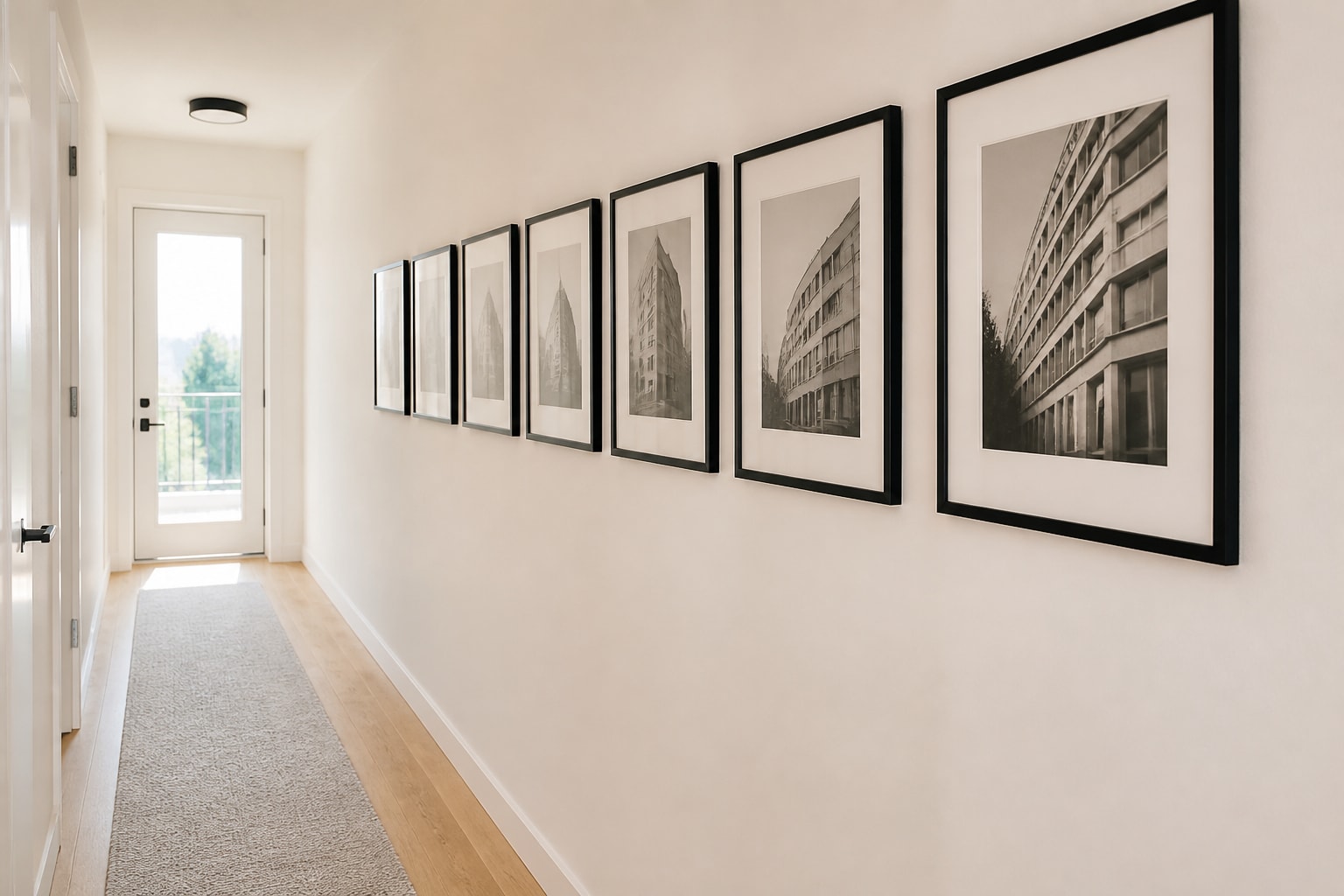
Seven architectural photographs turn the corridor length into an advantage. Matching frames, wide mats and aligned centres form one calm visual line, while the pale wall prevents the black outlines from becoming heavy. The frames are shallow and there is no console beneath them to steal walking width. This layout works best when the subjects form a series. If your images vary, use identical mats and edit them to a related tonal range rather than forcing unrelated pieces into sequence.
Anchor a small grid above a bench near the entrance
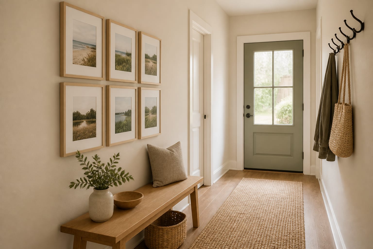
The bench gives this six-frame grid a clear reason to stop where it does. Pale oak, cream mats and quiet landscapes keep the entry bright, while coats remain on the opposite wall so the functions do not compete. Check that the bench depth still leaves a comfortable route when shoes or bags are nearby. In a smaller entrance, remove the bench and keep the same grid centred on the available wall rather than shrinking every frame until the photographs become hard to see.
Use one shallow ledge only where the corridor can carry it
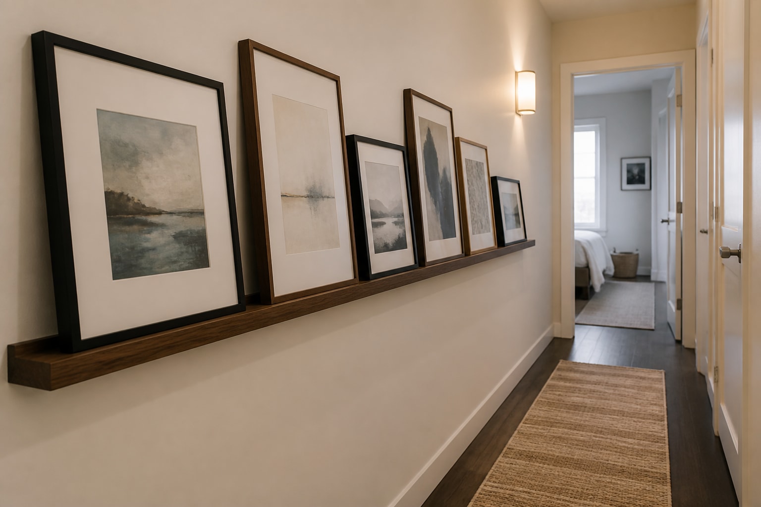
A picture ledge allows the display to change without adding new holes, but it is the least forgiving option in a tight corridor. This ledge is shallow, continuous and free of ornaments, so nothing projects farther than the frames. The repeated blue-grey artwork keeps the overlapping arrangement calm. Use the fixing method specified for the wall and combined load, and choose individual hanging instead if the ledge sits near a turn, a door or the natural path of shoulders.
Bring warmth to an older hallway with a restrained vintage mix
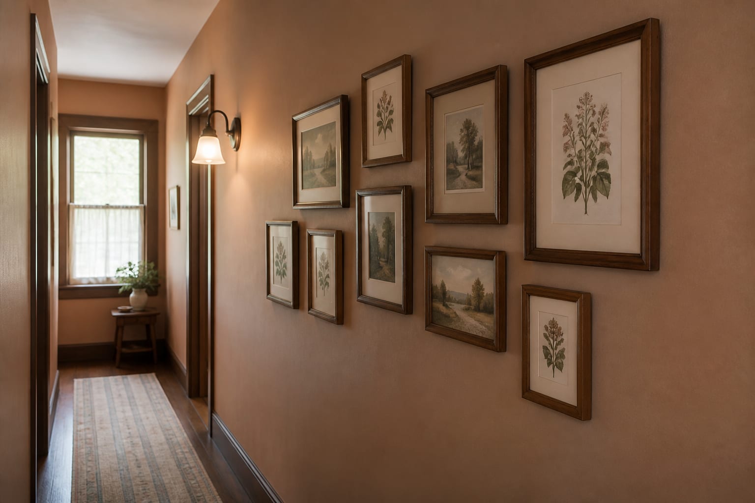
The arrangement is staggered, but repeated walnut frames and warm mats prevent it from becoming a patchwork. Most pieces stay between shoulder and eye height, leaving the lower wall and walking route visually clear. The clay wall colour turns the frames into a tonal composition rather than a row of dark outlines. Start with the largest botanical and landscape pieces, then add smaller frames only where they improve the overall silhouette. Empty wall at both ends keeps the collection contained.
Five rules for art in a tight circulation space
- Measure the narrowest point with nearby doors and cupboards open.
- Prefer slim frames and secure fixings that keep corners tight to the wall.
- Use one clear alignment rule: centred row, compact grid or defined outer boundary.
- Keep furniture beneath the gallery only when it serves a real entryway function.
- Leave the floor and lower wall visually calm so the corridor does not feel pinched.
Join the conversation
Share your thoughts on this room